Stage and Content Areas
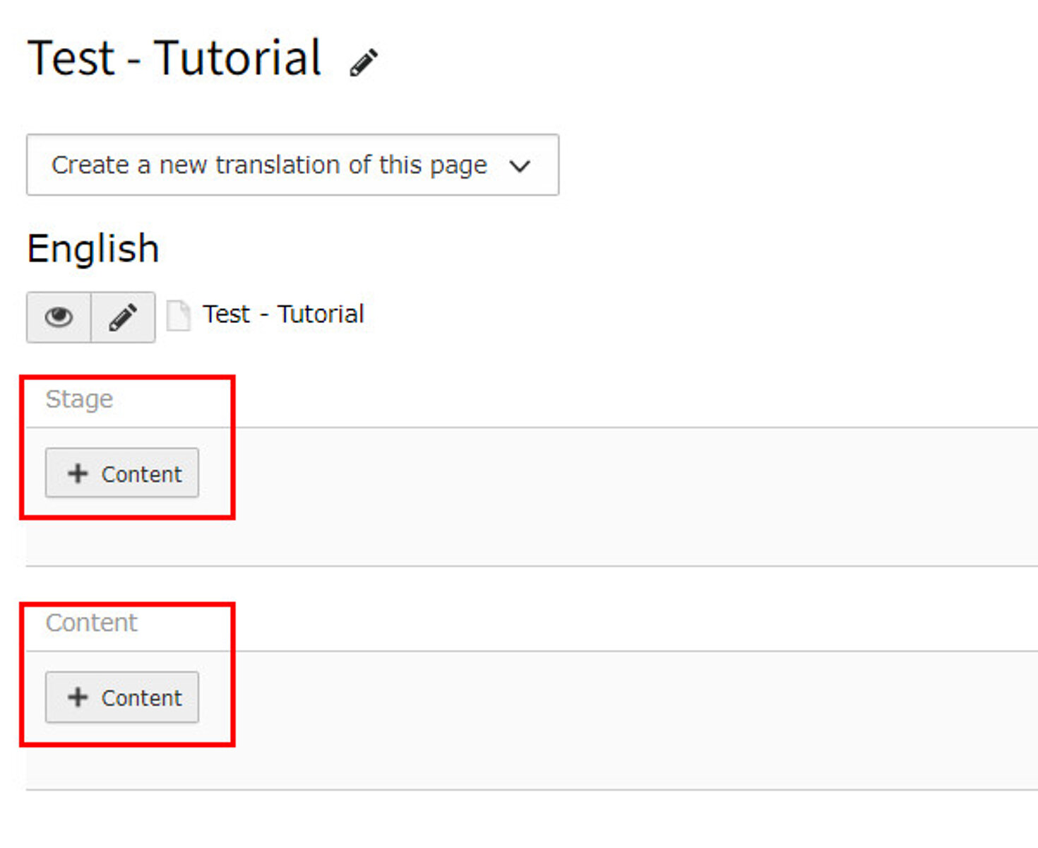
Please use the "stage" area for stage banners only. For all other elements, please use the "content" area.
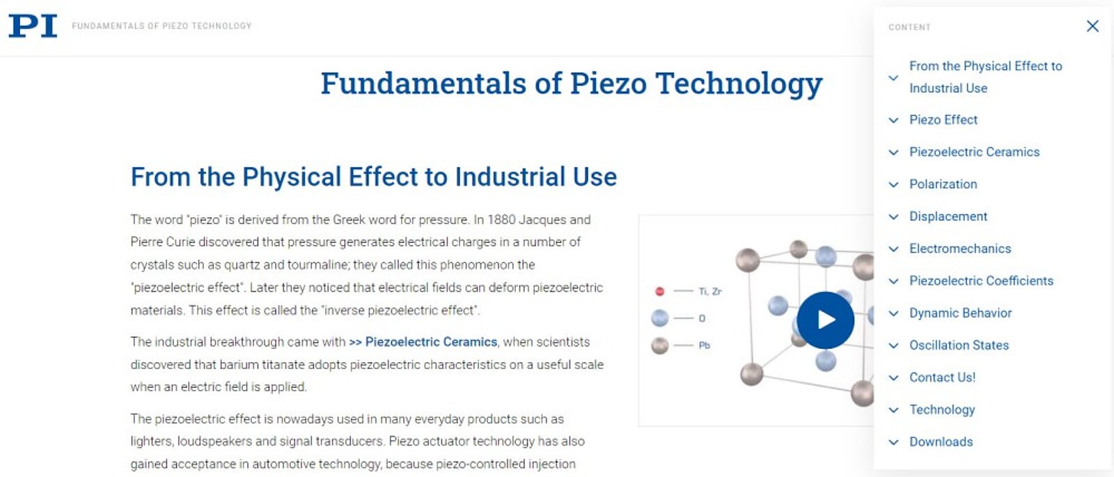
To add it you just need to fill in a header in your content element which will be shown in the sidebar and enable the "show in sections menu" option at the bottom of the tab "Appearance".
Only H2 headers should appear in the burger menu.
If your header is too long or you want a different one in the sidebar use the alternative header as header on the page and the header as the one shown in the Burger Menu.
Special Case: Insert Record Element
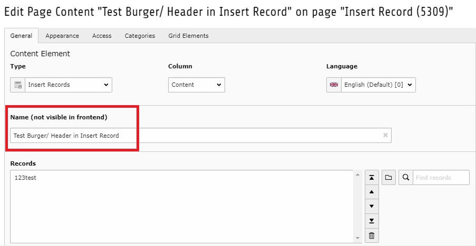
If you want to add an Insert Record element it's not possible to show the header of the inserted element in the burger menu. But you cabn add a title by using the box "Name" instead. This name will appear in the Burger Menu but not in the body text of the page.
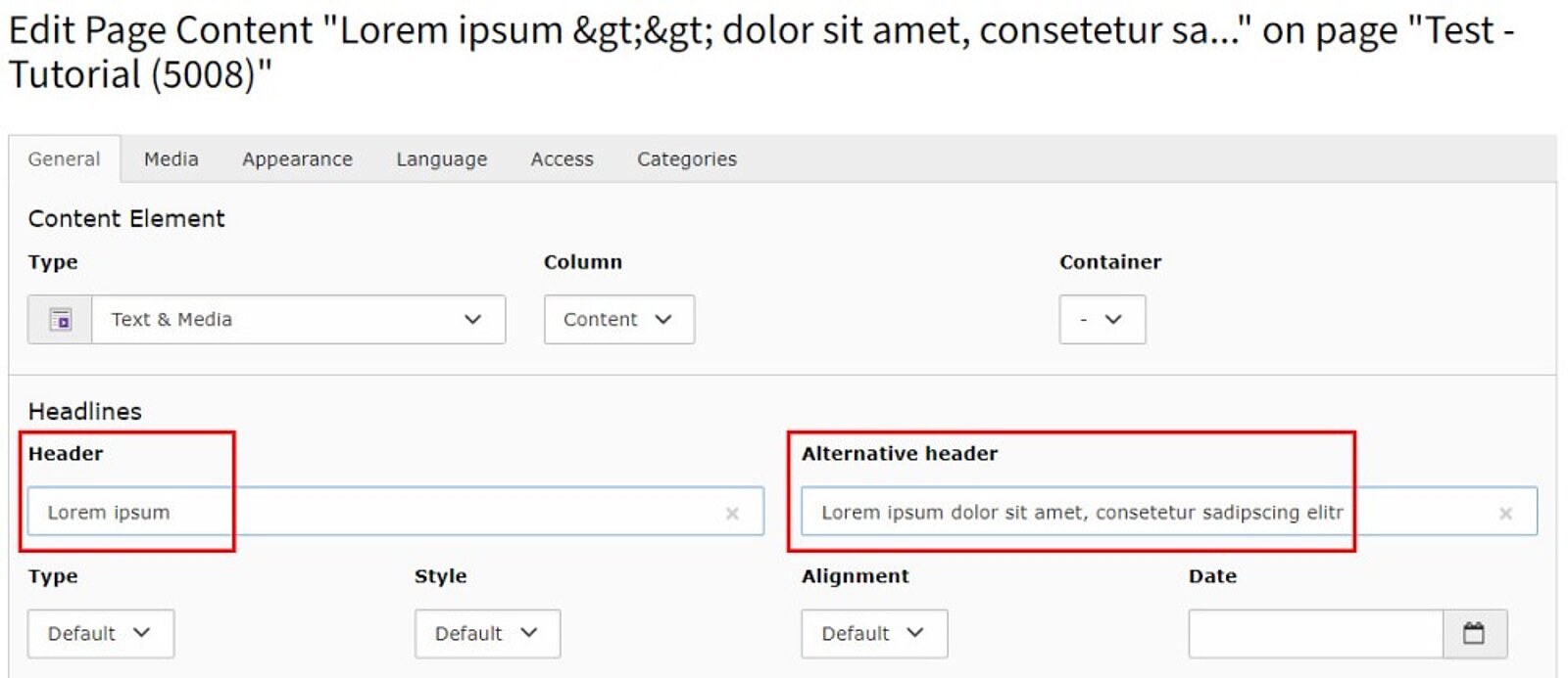
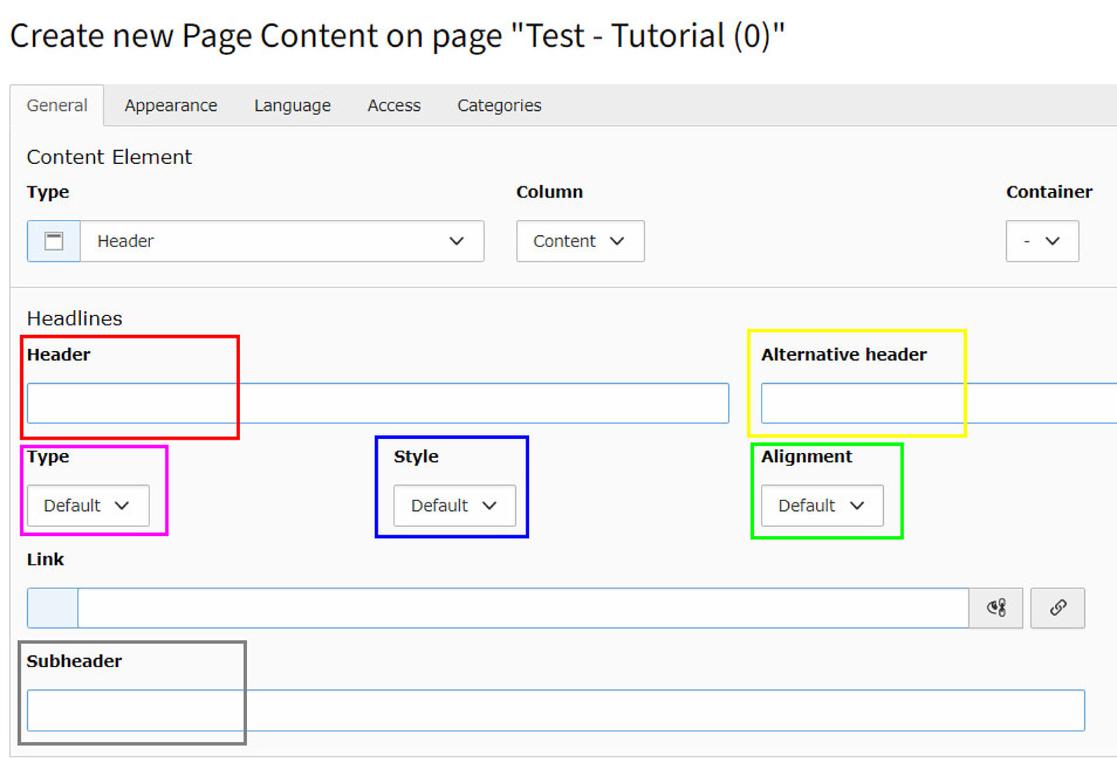
- Header (red): Add the header text
- Headers and subheaders are always capitalized, please use >> Chicago Style
- Alternative Header (yellow): If you would like to show the header in the burger menu and therfor use a shorter header use the alternative header fiel
- Header: Text is shown on the page and in the burger menu
- Alternative header: Overwrites the header text on the page
- You can add a shorter title for the burger menu to the "header" field, the longer title will still display on the page
- Type (pink): Choose the size of the header
- Default (H1) is the biggest, H5 the smallest
- A page should always have a hierarchical header structure, H1 as the main heading and then the gradations up to H5 depending on the hierarchy
- "Hidden" can be used if the header is only for internal reference and should not appear on the page
- Alignment:
- Set the position of your header: centered or on the left hand side
- H1 is always centered, H2 - H5 always left aligned
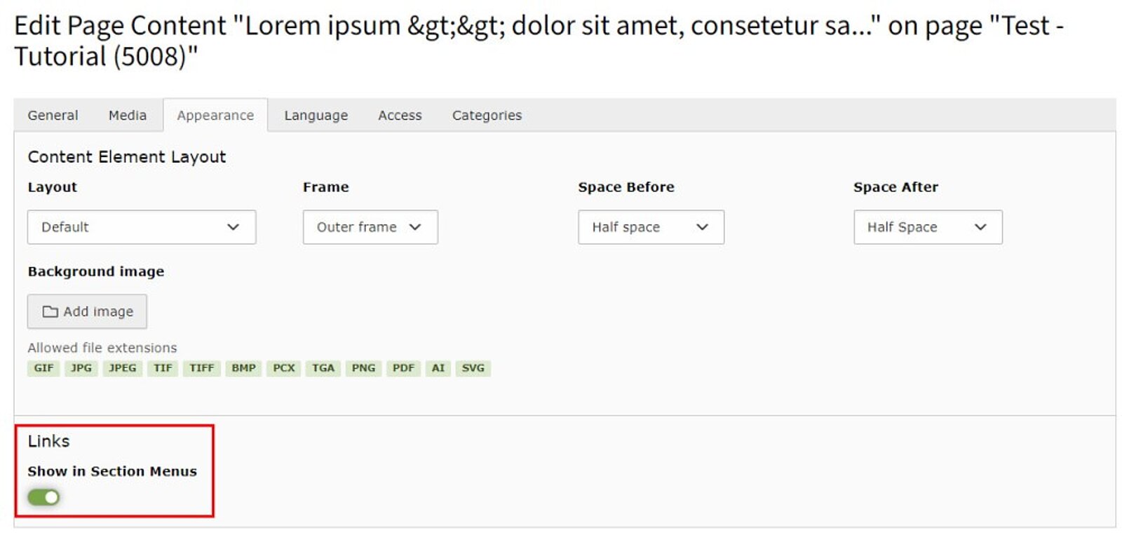
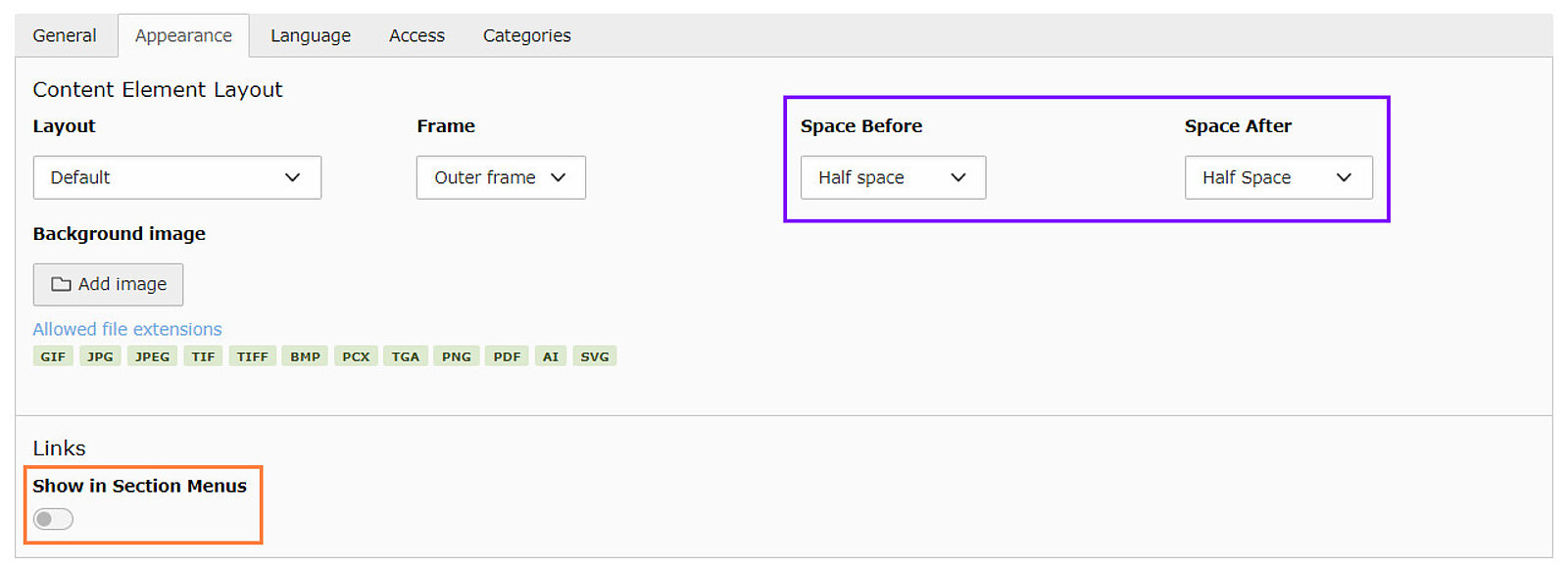
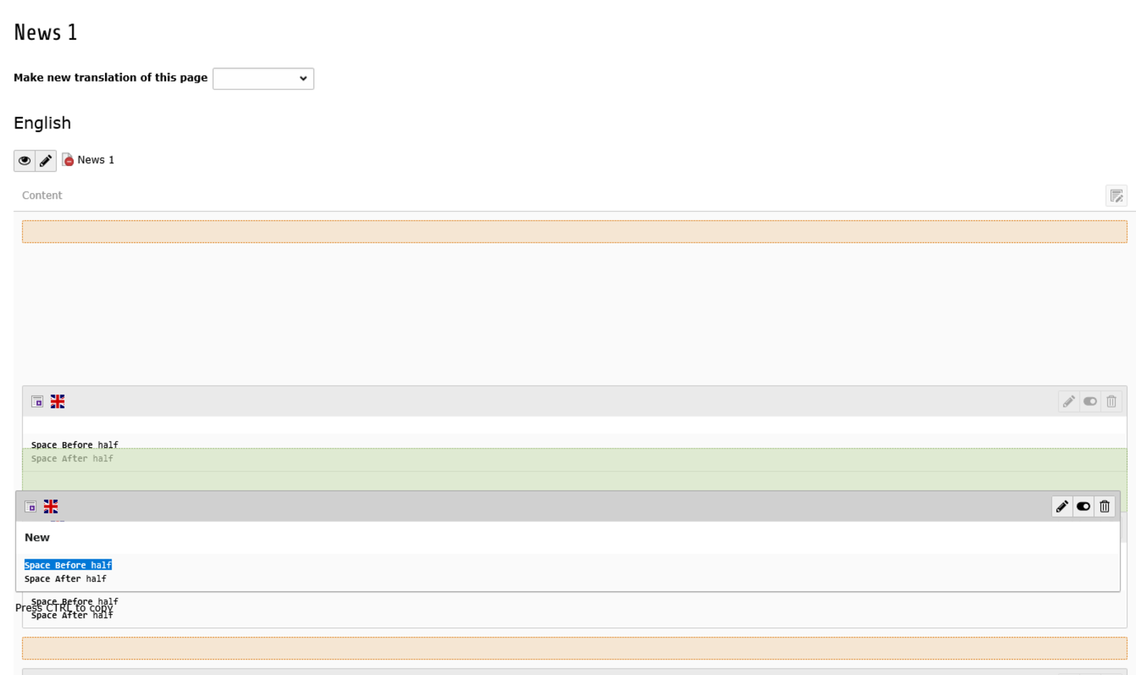
In the tab "Appearance" you can manage the space between content elements.
- Space before / Space after (purple):
- You can manage the spaces on top or at the bottom of your header.
- Standard setting is: Space before / Space after = half space
- Show in Section Menus (orange):
- Enable or disable link in burger menu
- Only H2 headers should appear in the burger menu
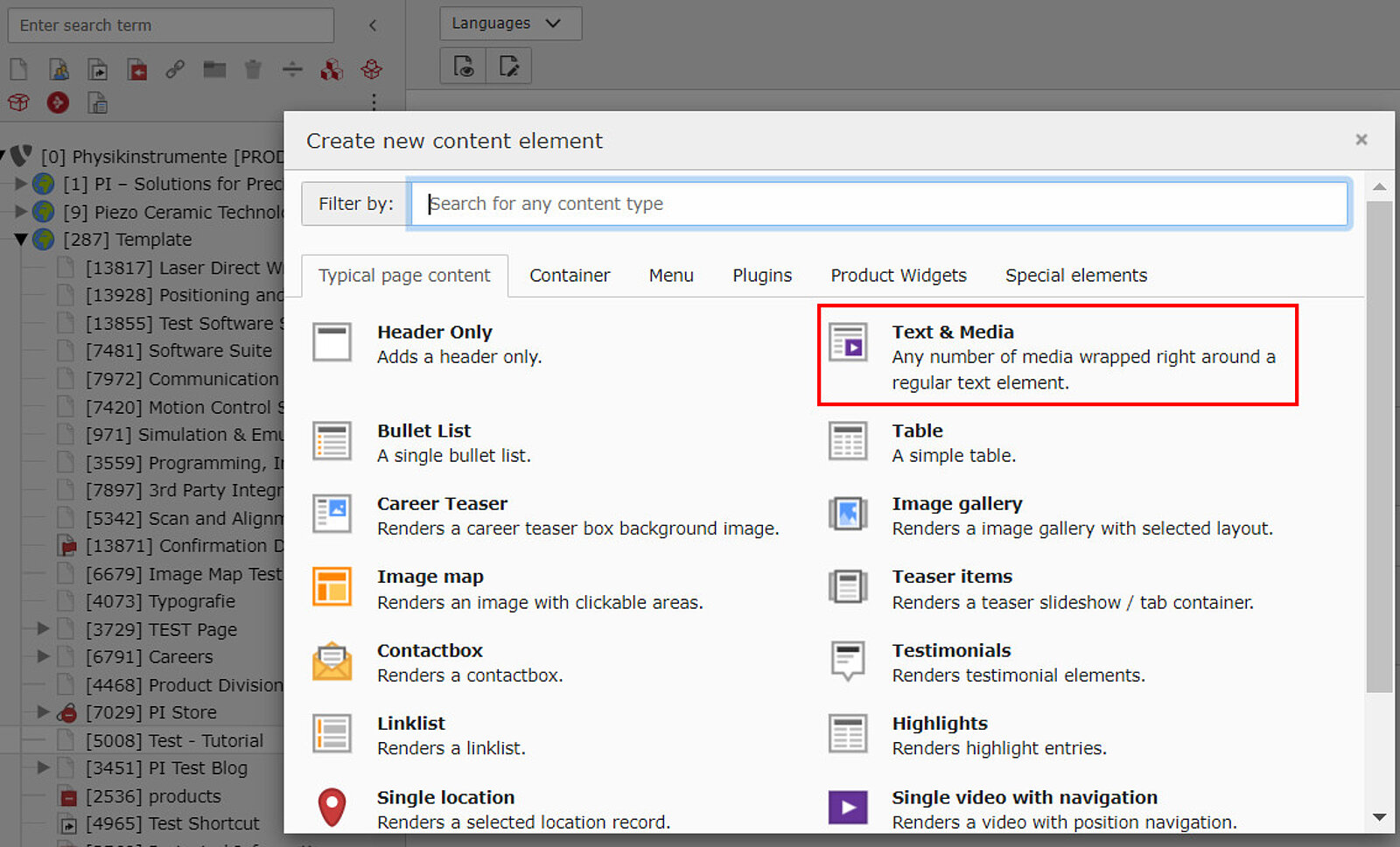
Insert Text
- Header information can be added as >> explained here.
- Insert your text to the textfield and use the formatting options if needed.
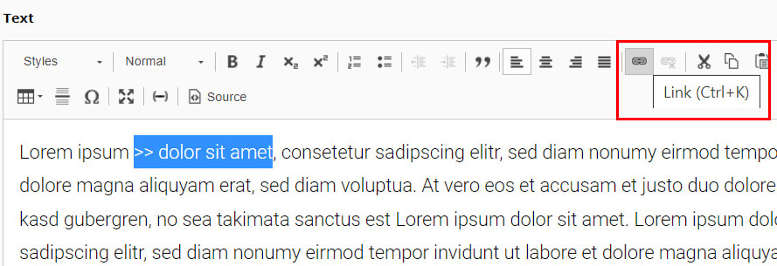
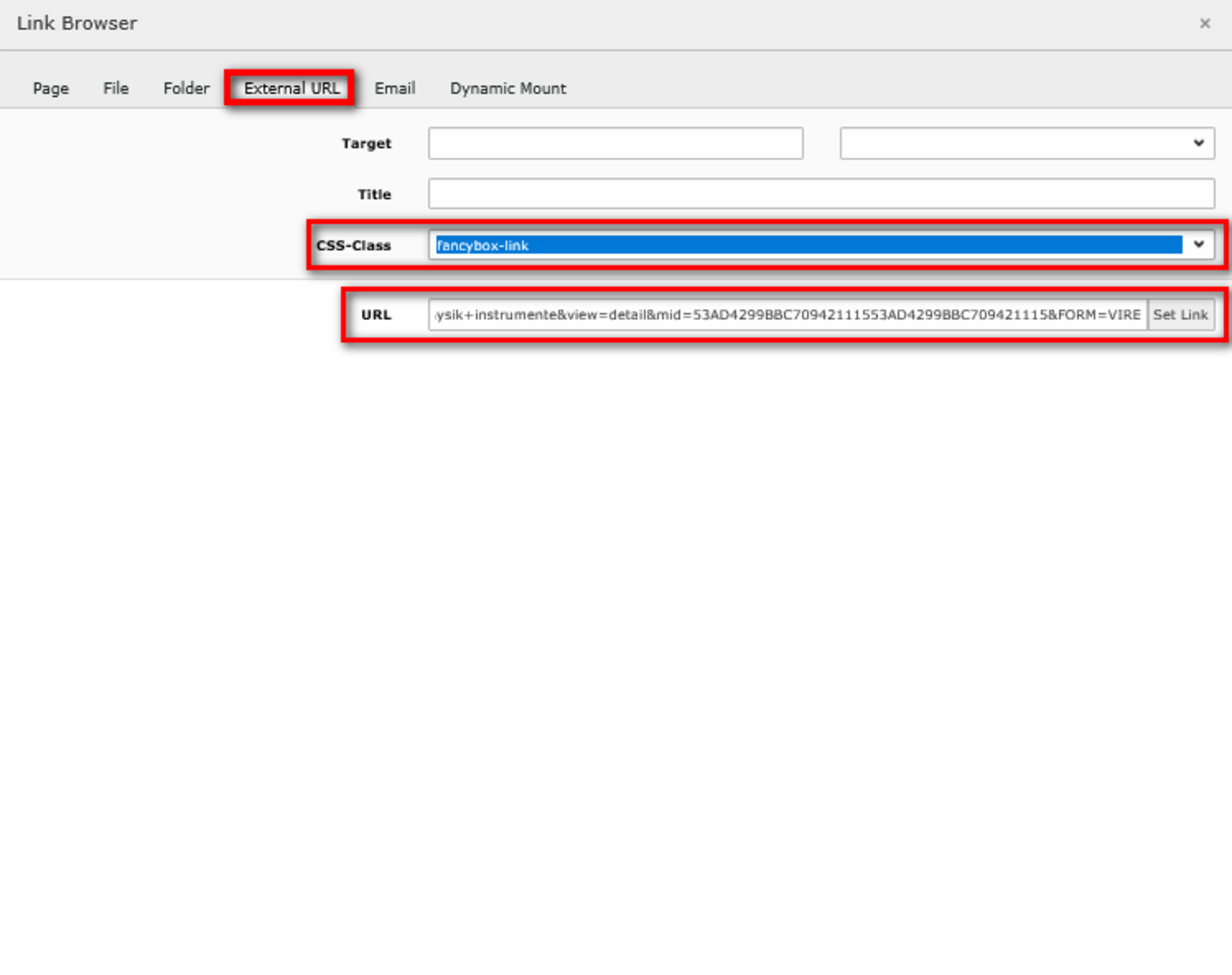
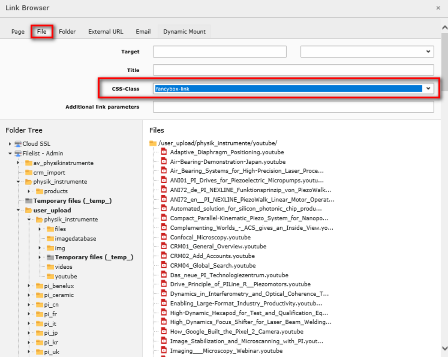
- The Link Browser opens. You can decide if you would like to link a page, a file, a folder, an external URL, an email or a phone number (yellow).
- Target (orange): If you would like your link to open in a new window, choose "New Window".
- Usually we do not use the title which would appear when the user hovers over the link.
- "CSS-Class" (green): You can choose the appearance of your link using one of the options given.
- Additional link parameters (blue): Mount point parameters can be entered in this field, which ensure that the link works on all domains.
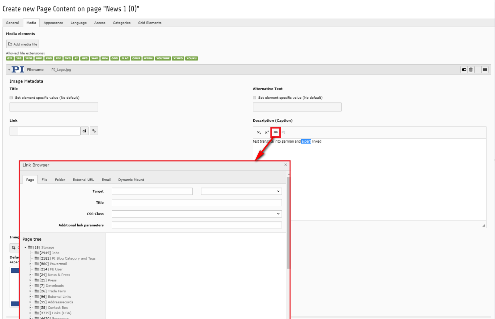
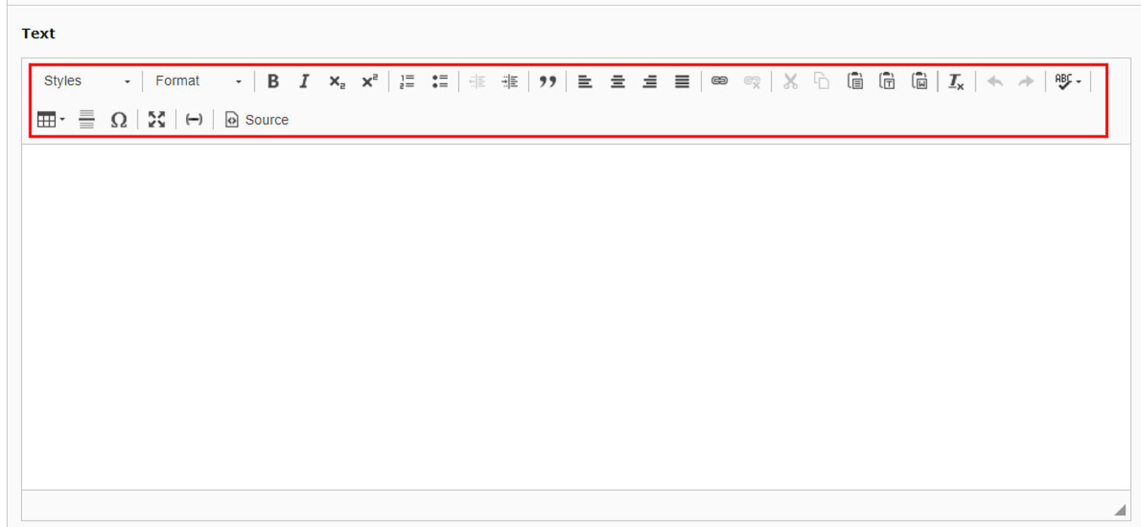
- It is also possible to link parts of the captions
- Highlight the text that should be linkedin the caption field
- Click on the link symbol
- The link browser opens
Link to Call up Cookie Banner
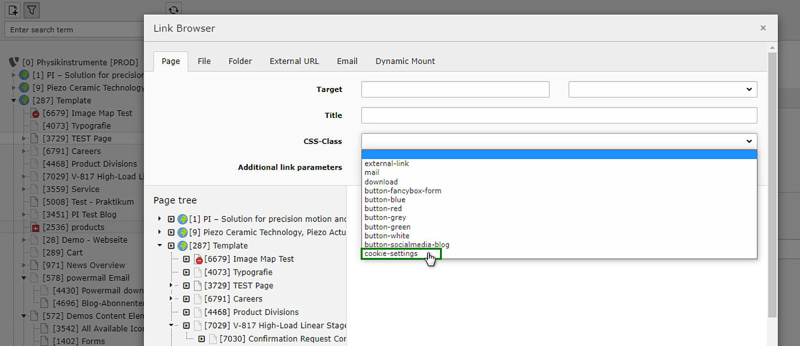
- A link can be set to call up the cookie banner.
- This offers the user the possibility to adjust his cookie settings at any time.
- To add this link, select "cookie-settings" from the CSS-classes and from the page tree, select the page on which you would like to place this link (the page you are currently working on).
Upload a Media File
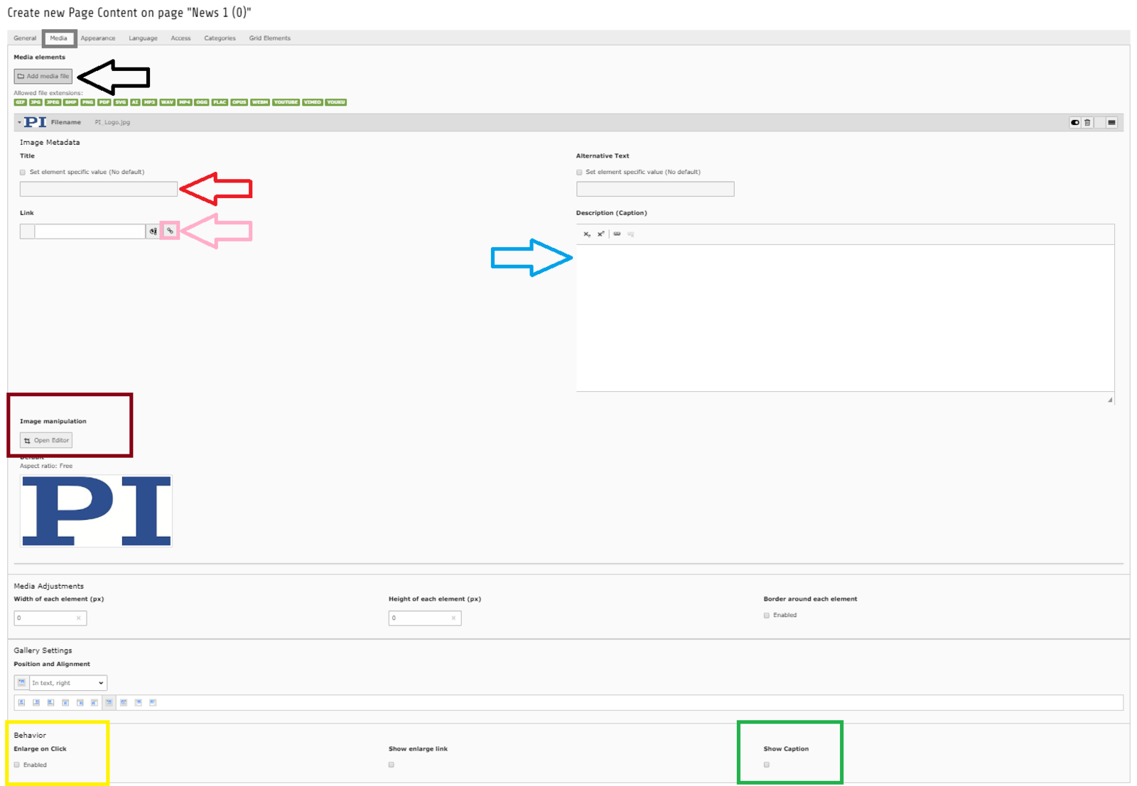
Choose the tab "Media" and add your media file by clicking on the button indicated by the black arrow. Each element must first be uploaded on your TYPO3 filelist.
You can set the "Image Metadata" for each image you upload:
- "Title" (red arrow): Possibilty to insert a title of the picture that will appear if a user stops the mouse on the image without clicking but not used. Use "Alternative text" instead (if not default alternative title given yet). This title is shown if the image cannot be loaded and important for Google.
- "Link" (pink arrow): Set a link on the picture, so a user who clicks onto the image will be taken to the linked page. You can insert the URL in the box indicated by thepink arrow or choose a path of TYPO3 by clicking on the button surrounded by thepink circle
- "Description (Caption)" (blue arrow): This text will appear under the image.
- "Image manipulation" (brown circle): Click "Open Editor" to enter the tool to resize or cut your picture
- "Enlarge on Click" (yellow circle): If you activate this box the image inserted will enlarge to full size whenever a user clicks on it
- "Show caption" (green circle): To make the caption visible check this box. If you only want the caption to be visible in the fancy box do not check the box, but add your caption to the box with the blue arrow.
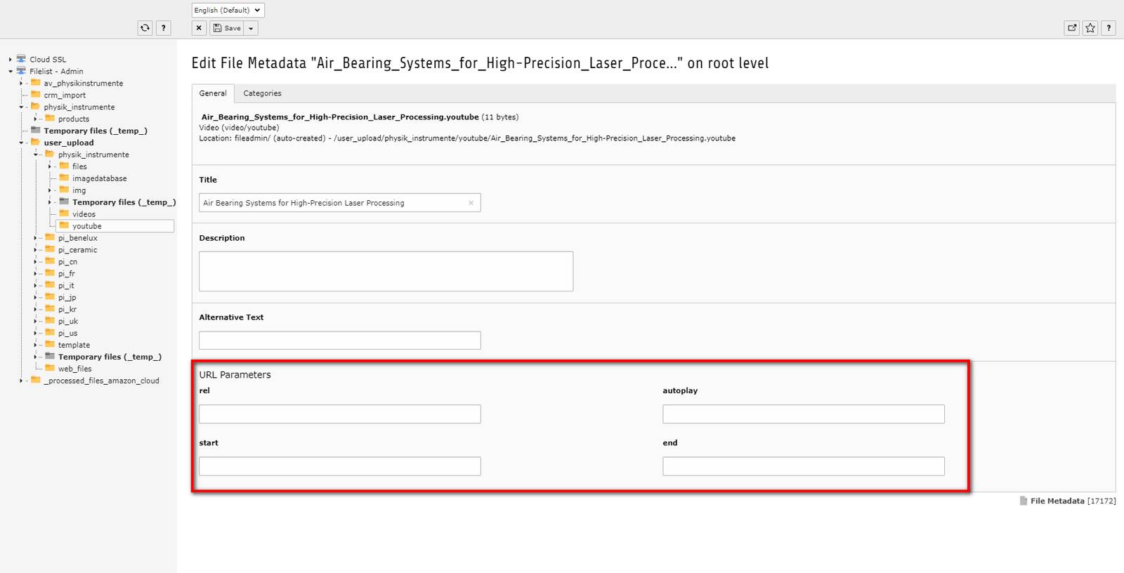
Uploading Youtube Videos with Parameters
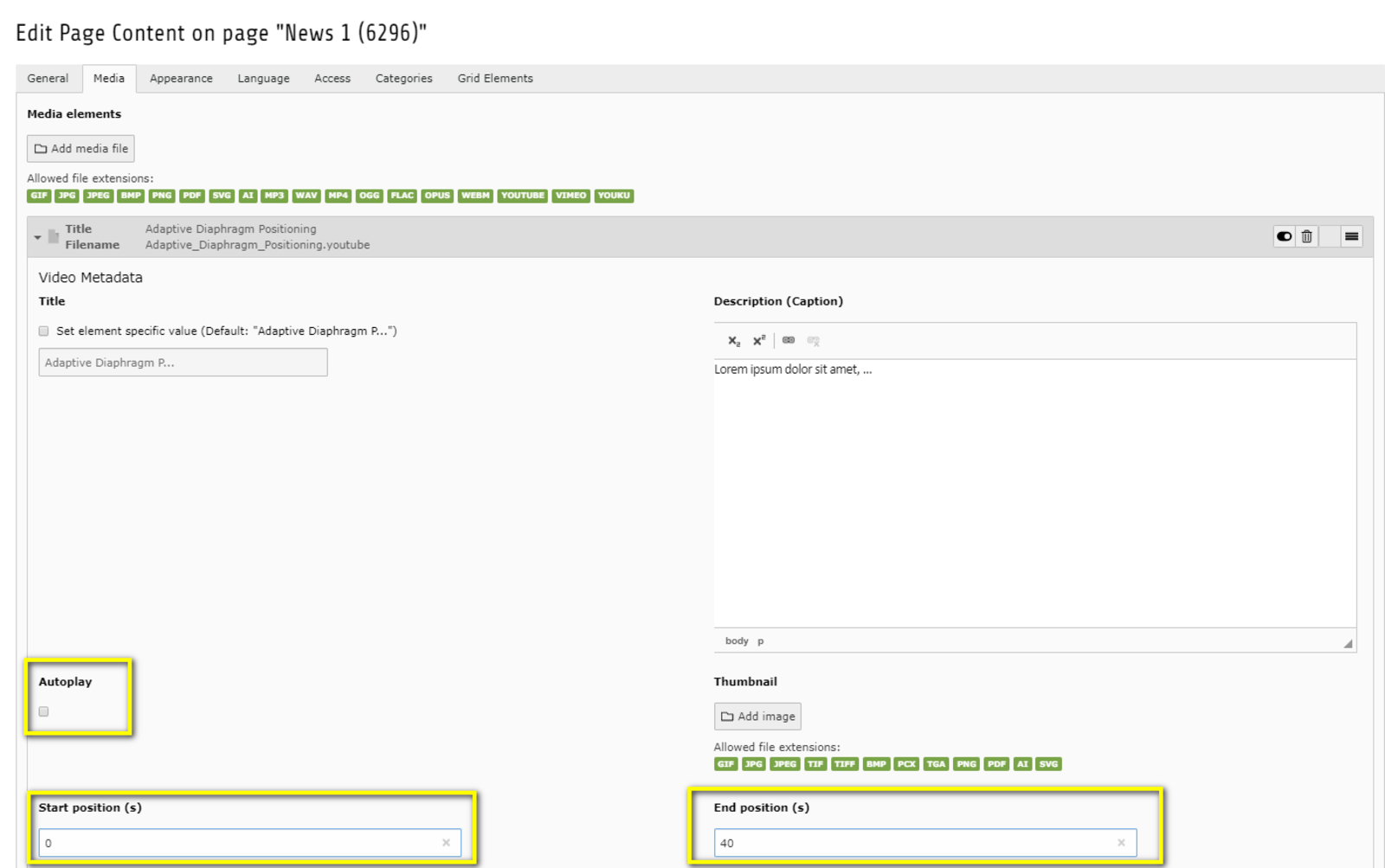
When Youtube parameters like autoplay, start and end position or “rel” (relations, which videos shall be shown next) are added to a video on Youtube, they are included to the uplink and saved for every further use of the video in TYPO. E.g. when second 10 is defined as the start position, this will be saved to the video (e.g. https://www.youtube.com/watch?v=3fmje9IJYJM&rel=0&start=10&end=20&autoplay=0) and set as default whenever the video is used.
- Parameters of YouTube videos can be changed in the filelist without uploading them again.
- Very important: Please always check the references of the videos first, as the parameters are then applied everywhere, even on product detail pages. Please use this very carefully.
- The same video may only appear once in a filelist folder.
- If you need it in different places with different parameters, you have to upload it to a different folder.
Red Youtube Button in the Rich Text Editor
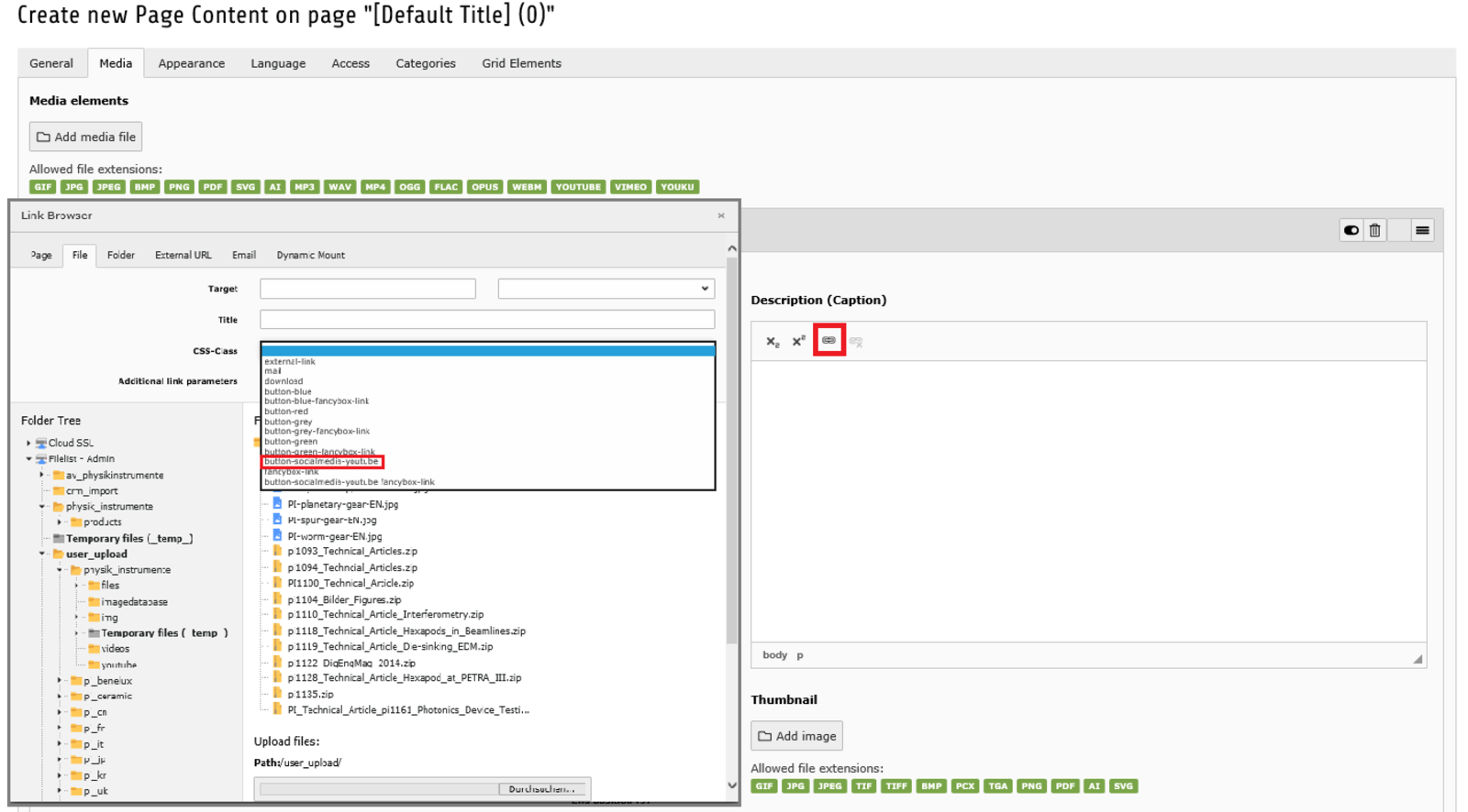
- For internal links to videos from the filelist or for external links.
- There is an additional button style available: A Youtube icon which you can use for internal or external links to videos on Youtube.
- Go to the "file" tab and choose an uploaded video from there or go to the "external URL" tab and add a link to a video.
- Under "style" select "button-socialmedia-youtube".
Adjusting the Image Appearance
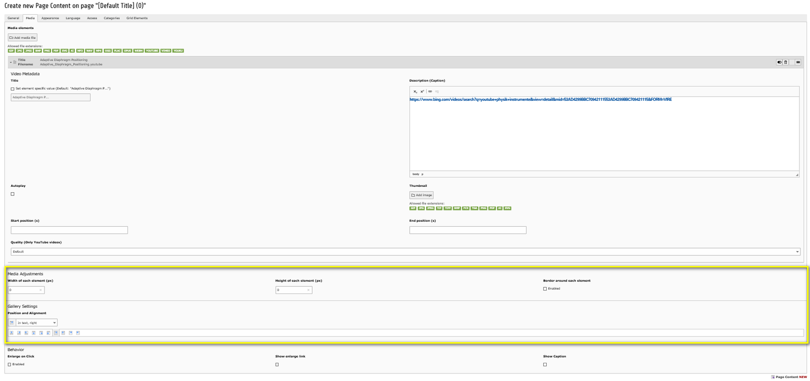
In the "Media Adjustments" and the "Gallery Settings", indicated inyellow, you can define the size of your image in pixels. Just insert the width and height.
There is also the possibility to make a border around your image. Just activate the checkbox of "Border around each element".
Choose between the options of position and alignment of your image in "Gallery Settings".
- If you choose position and alignment option "Above, right", "Below, right", "In text, right", "Beside text, right", your caption will also be right-aligned.
- If you choose position option "Above, left", "Below, left", "In text, left", "Beside text, left", your caption will also be left-aligned.
- If you choose position option "Above, center", "Below, center", "In text, center", "Beside text, center", your caption will also be centered.
Moving Content Elements
It is still possible to move a content elements around, after you added them to a certain position on your page.
- Select the content element you would like to move.
- Drag it to the position you would like to have it and move it around until you see a green box (instead of the red one that will show up until you found the right position).
- Drop it to the green box.
Bullet List
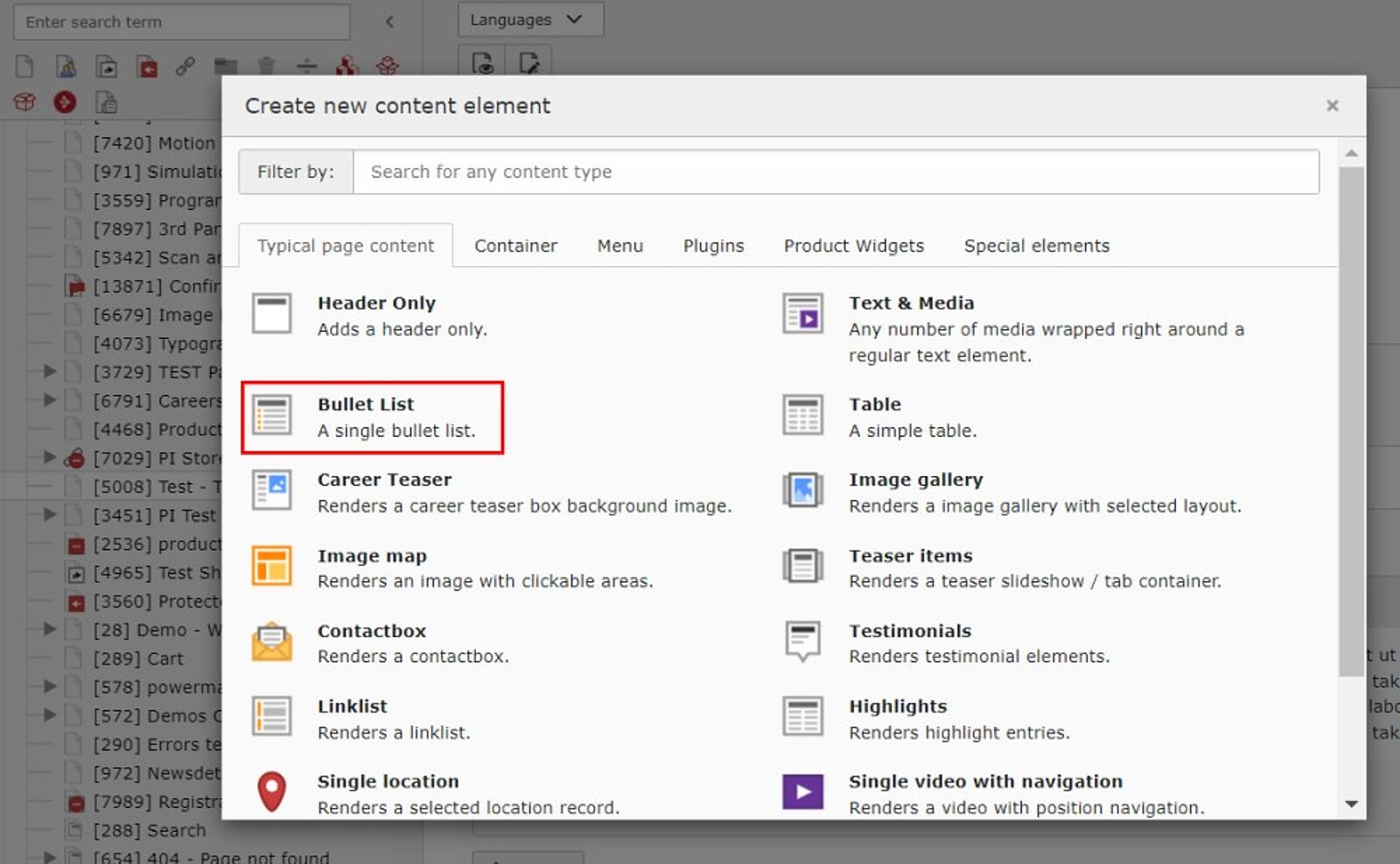
- The bullet list ist the most common type of listing item
- "Typical page content"
- "Bullet List"
Setting up Your List
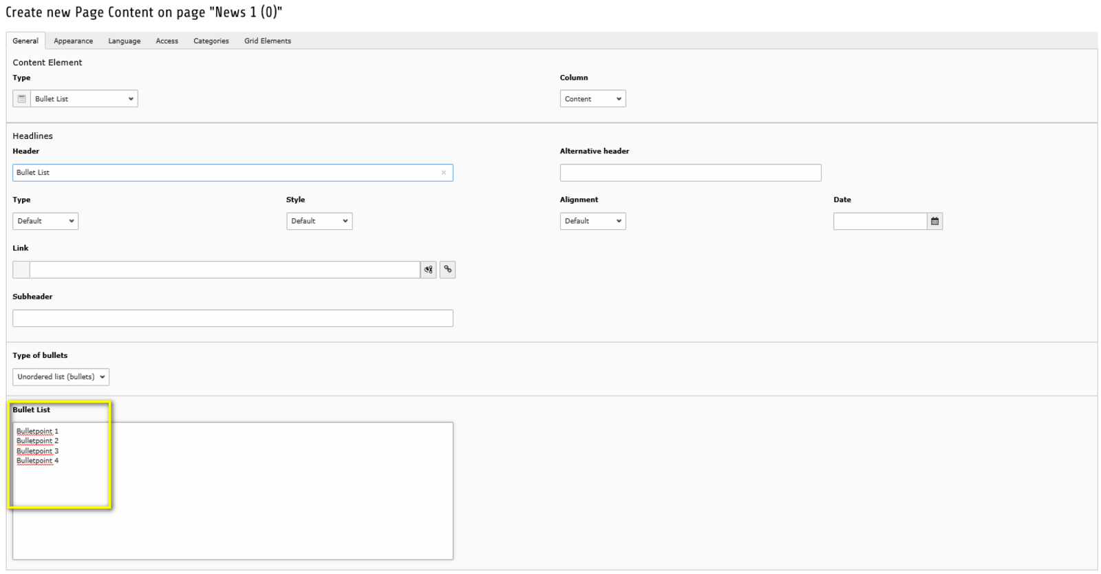
- Insert the content of your list to the field "Bullet List".
- Each new line is a new bullet.
- >> Preview on how it will look like
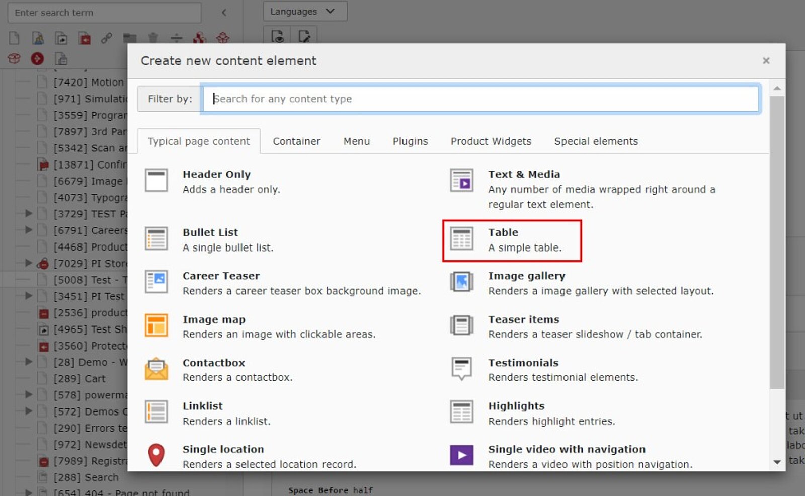
Setting up Your Table
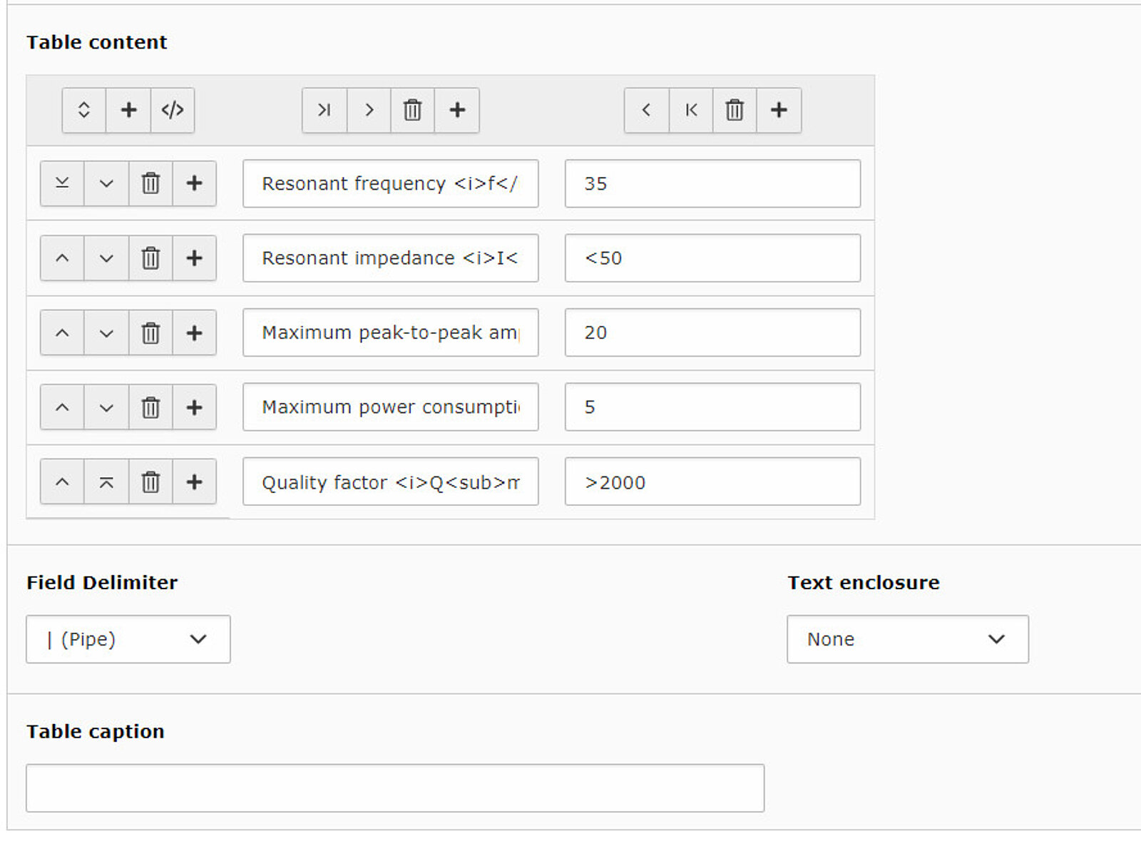
- You can add rows and columns using the plus signs
- In the "Table caption" field you can insert a title for the table that appears in the upper left corner of the table
Table Layout
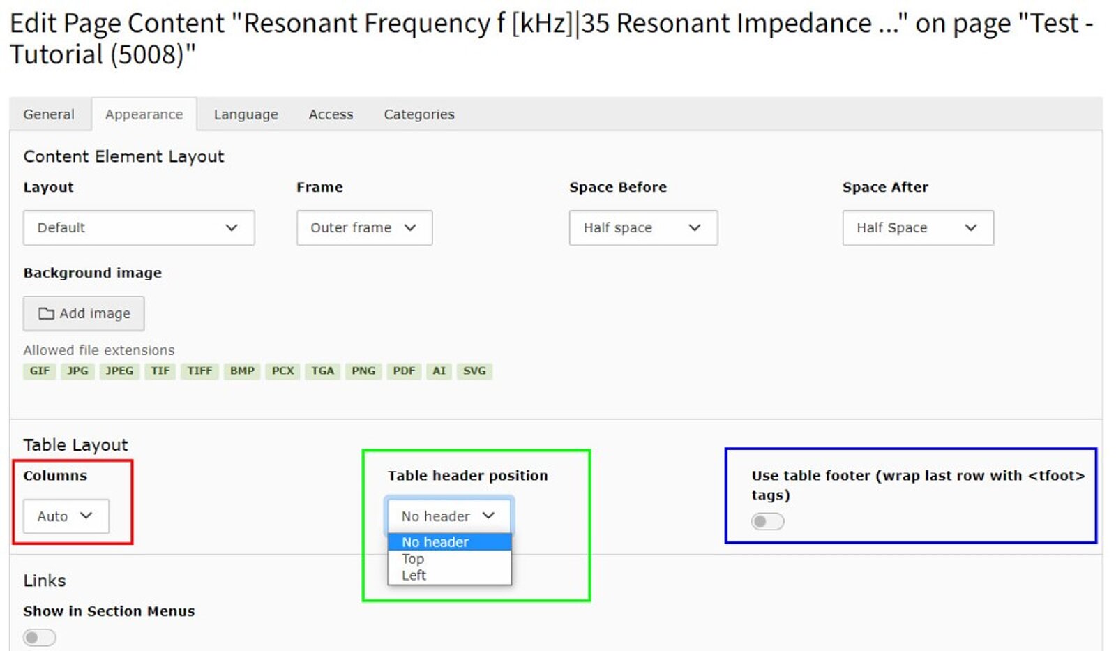
In the "Appearance" tab you can make further changes to the table:
- Define the amount of columns
- Define the position of the header of your table (no header / top / left)
- Use table footer: By activating this checkbox you can change the layout of your last row. It will appear out of the table border as a table footer
- >> Example of how your table could look like
Image Map
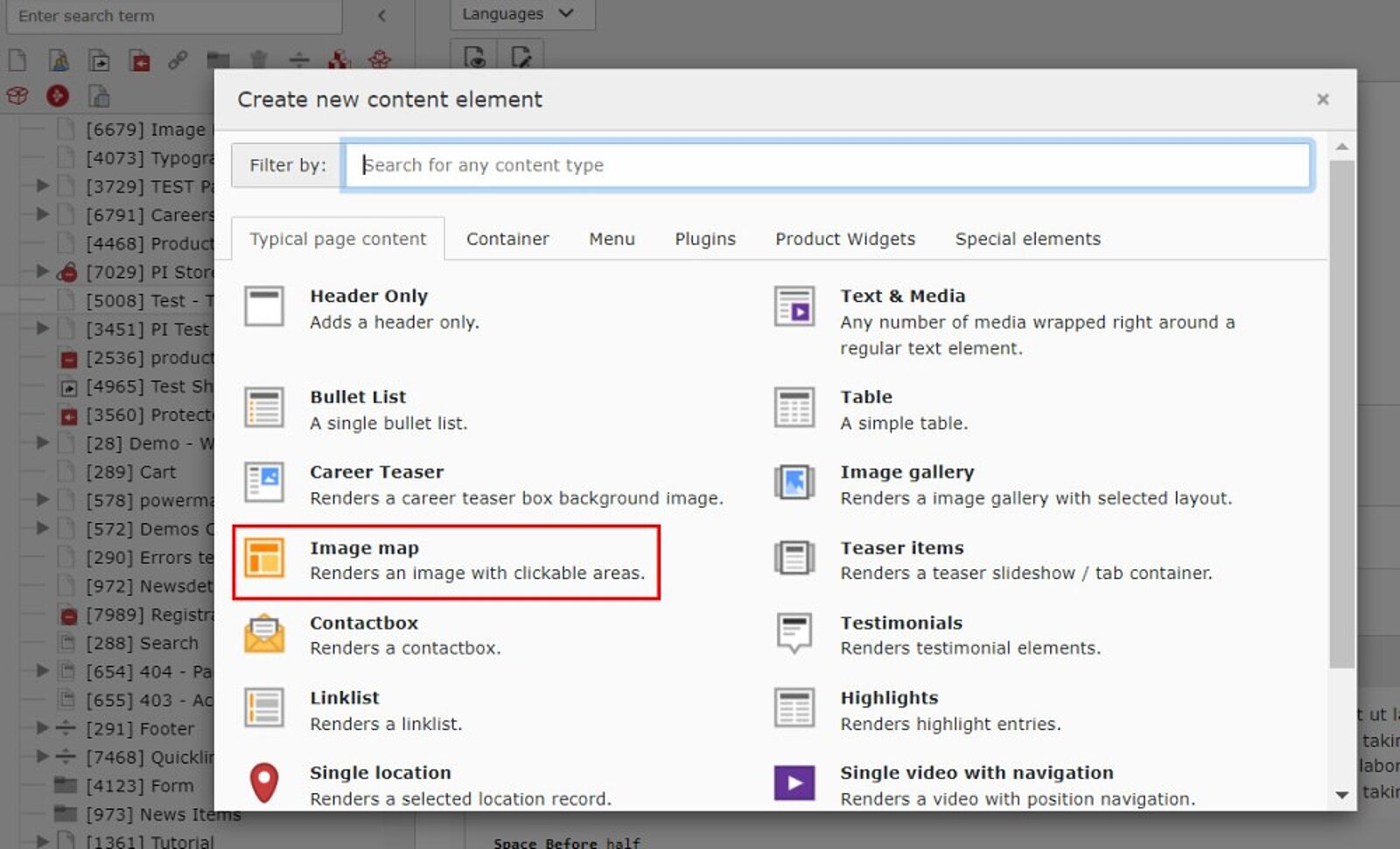
- Create a new content element "Image Map" (marked red).
- Select a media element from the Filelist and SAVE.
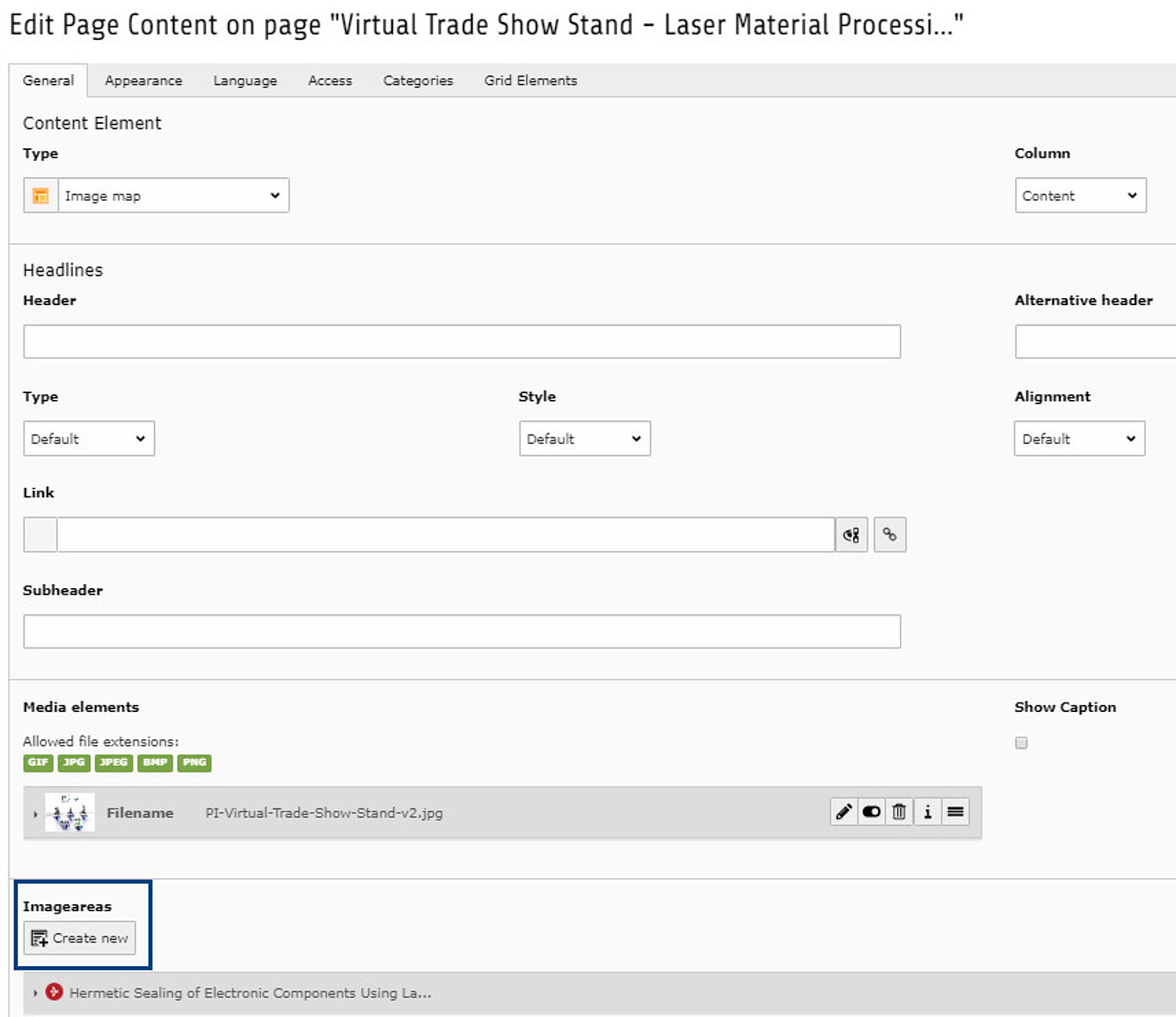
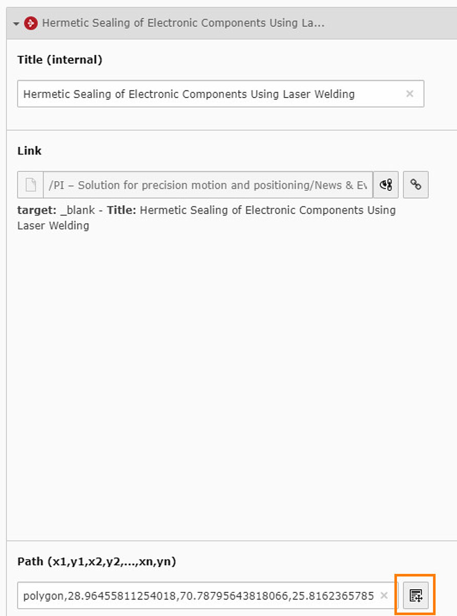
- Name the imageareas (for your internal reference).
- Use the Link Wizard to select the page you want to link to.
- Mark the area on the graphic you want to link with the "path" tool (marked orange).
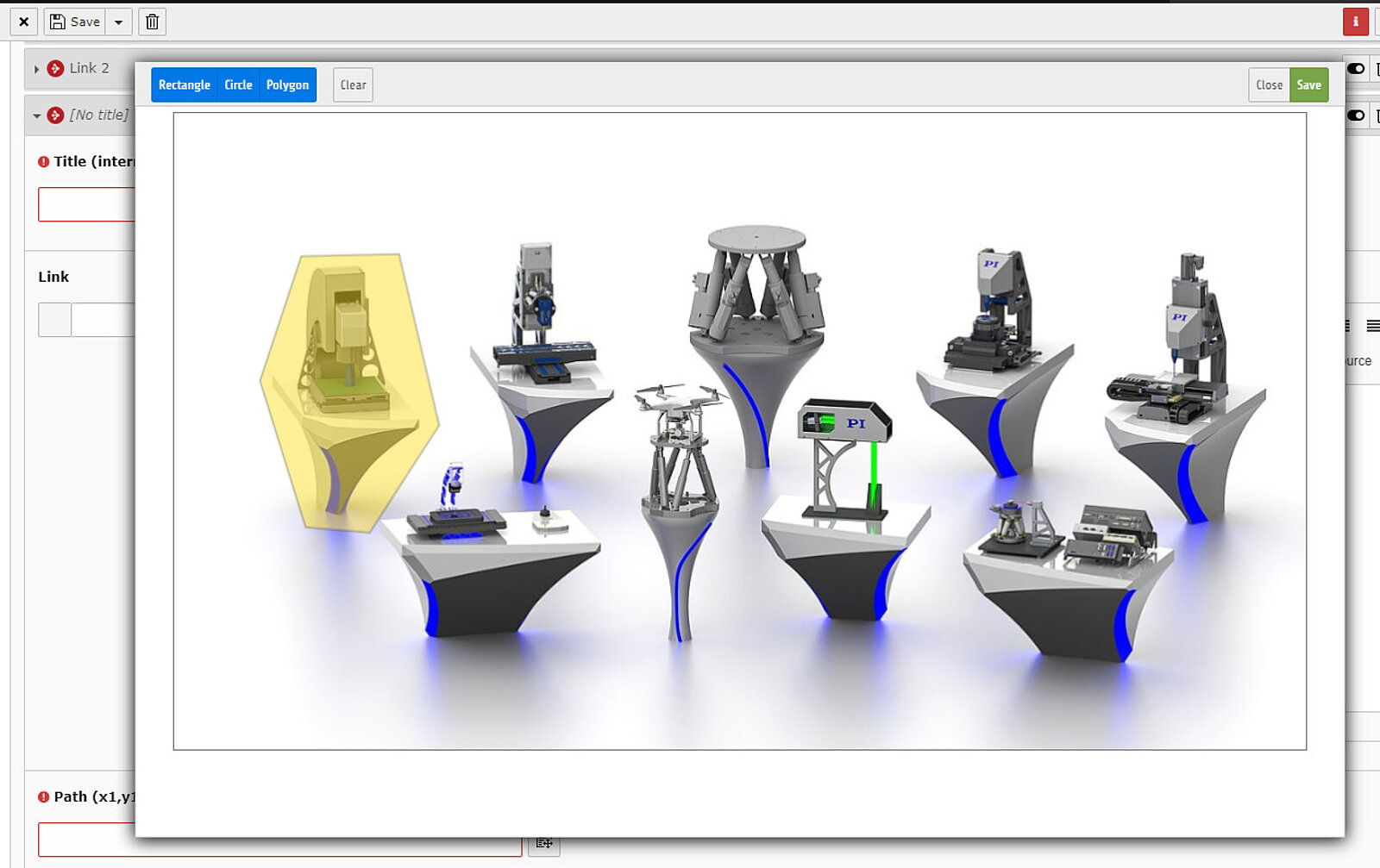
- You can use a rectangular shape, a round shape, or a polygon, whichever fits best, for the area you want to mark. This area is clickable.
- Create additional imageareas to create more clickable areas.
Selecting the content element Highlights
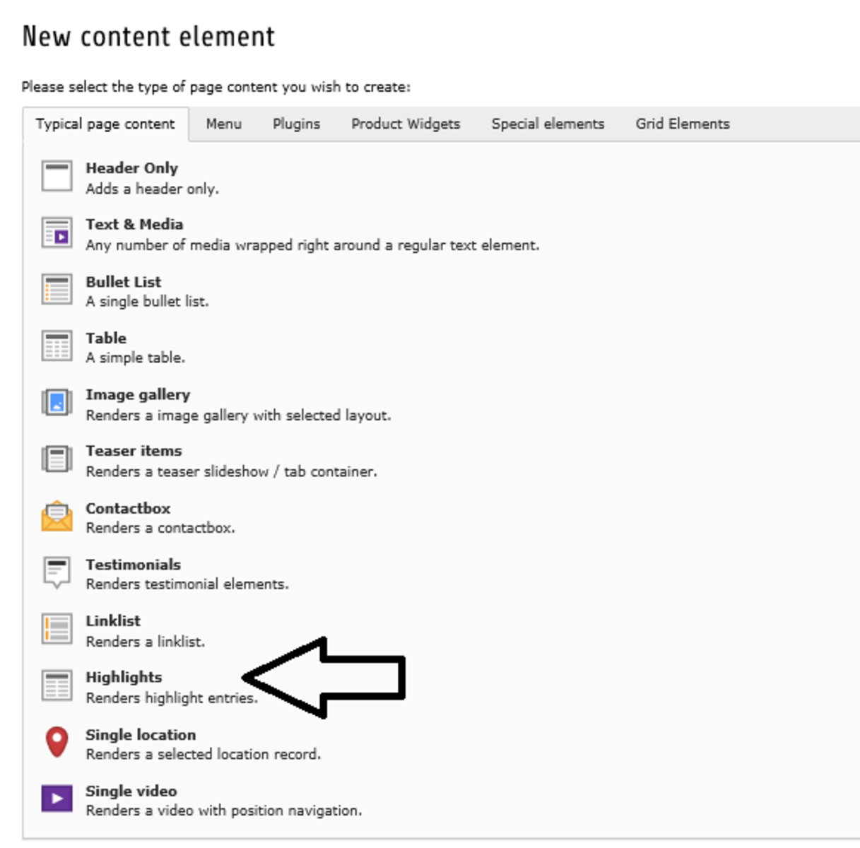
Selecting the content element Highlights
If you want to create an area of highlighted terms on your website, choose the itam "Highlights", indicated by the black arrow, in the section "Typical content elements"
Inserting the text to highlight
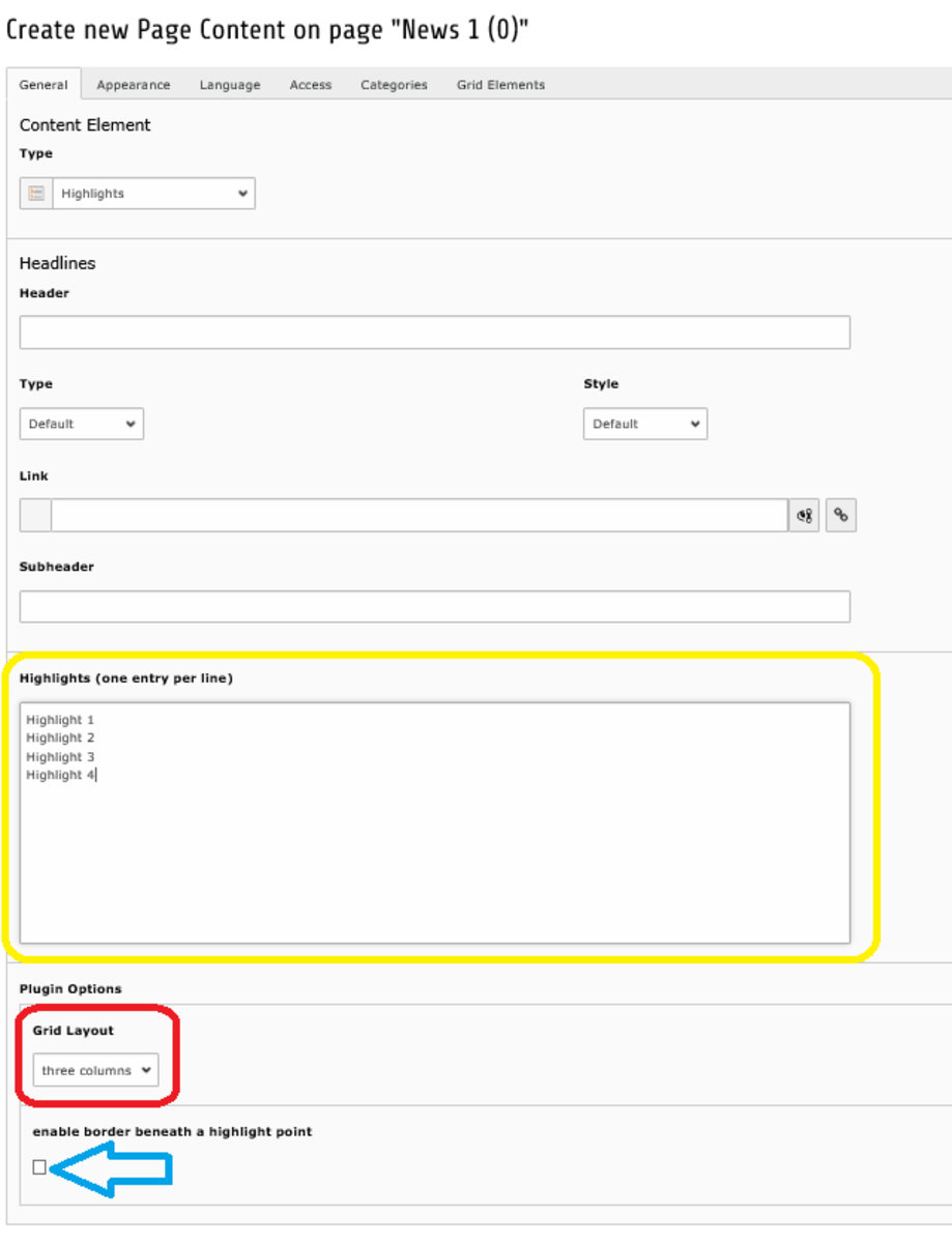
Inserting the text to highlight
The yellow circle indicates the box where you can insert your highlight points. Each new line is a new highlight, which on your website will be indicated by a cross.
- red circle: Here you can set the positioning of your highlights by choosing between three or one column
- blue arrow: If you activate this checkbox every row of your highlights will be divided by a small line
>>Here a preview on how it will look like with three column and without border beneath.